
Most bookshelves look cluttered not because they hold too much, but because nothing has been chosen. Things accumulate. Objects land where there was space. Over time, a shelf stops feeling designed and starts feeling like storage.
The difference between a shelf that looks considered and one that just looks full comes down to a few decisions made in the right order. This is how designers make them.
Key points at a glance
- Always start with an empty shelf. Editing before placing is the whole game.
- Books do more when they're grouped, stacked, and mixed with objects, not just lined up spine-out.
- Vignettes work through rhythm, not perfect symmetry. Odd numbers, varying heights, intentional gaps.
- Texture and material contrast, wood against ceramic, linen against glass, create depth without adding clutter.
- Negative space is not wasted space. It's what makes everything else land.
- Light, whether natural or a small directed lamp, changes the entire mood of a shelf.
What you'll take away
Start by taking everything off
This is the step most people skip, and it's the most important one. You cannot style a shelf while it's full. You can only rearrange clutter.
Take everything off. Wipe the shelves down. Stand back and look at the structure itself: the proportions, the depth, the light. You're about to make decisions, and you need a clean surface to make them on.
Edit before you style: the objects that earn their place
Before anything goes back, ask one question about each object: does it earn its place visually? Not sentimentally. Visually.
That doesn't mean removing things you love. It means being honest about what draws the eye forward and what just fills space. A shelf with twelve good objects will always look better than one with thirty average ones.
- Keep objects with strong silhouettes: sculptural ceramics, glass vessels, woven baskets
- Remove anything purely functional that can live elsewhere (charger cables, random keychains, old receipts)
- Set aside duplicates. One small succulent is a moment. Five is a collection that needs its own shelf
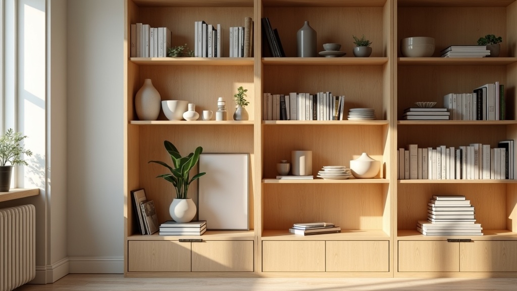
How to arrange books so they do more than fill space
Books are the hardest element to get right, especially when you have a lot of them. The instinct is to line them all up vertically, spines out, tallest to shortest. It looks like a library. It rarely looks like a home.
Mix vertical and horizontal
Stack three or four books horizontally at the end of a row. Place an object on top of the stack. This instantly breaks the uniformity and creates a platform for smaller pieces that would otherwise disappear.
Group by colour or tone, not by author
Removing dust jackets often reveals beautiful, quiet linen or cloth covers underneath. Grouping books by spine colour, neutrals together, darker tones together, creates a calm visual rhythm that lets other objects breathe.
Leave some books facing out
One or two books shown cover-forward break the spine grid and add a personal, lived-in quality. Choose covers with simple, graphic design. Avoid anything overly commercial.
Did you know?
The average paperback spine is about 20, 30mm wide. A single shelf of 30 books creates nearly a metre of unbroken vertical texture. Breaking that line with just two or three horizontal stacks reduces visual noise by roughly 30 percent, according to interior design compositional theory on eye movement and shelf density.
Build vignettes with rhythm, not symmetry
A vignette is a small, composed scene within a shelf. Think of it as a still life. The instinct is to mirror it, one object on each side, same height, balanced. That instinct produces stiffness.
Rhythm is more interesting than symmetry. Use odd numbers. Vary heights within a group. Let one element lean slightly, let another sit lower, let one be taller than you'd expect.
- A trio works: tall ceramic, medium-height stack of books, small stone object
- Let the tallest item sit off-centre, not at the edge and not dead-centre
- Connect elements within a vignette through one shared quality: same material, same tone, or same organic shape
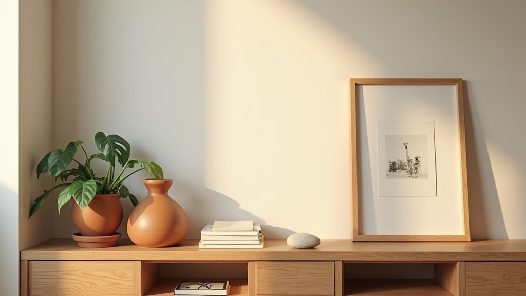
Bring in texture, warmth, and material contrast
A shelf made entirely of smooth objects looks cold. A shelf made entirely of rough, organic objects looks unfinished. The tension between materials is what makes it feel designed.
Pair matte with gloss. Rough with smooth. Heavy with light. A stoneware vase next to a glass candleholder. A woven basket beside a stack of cloth-covered books. A raw wood object alongside a polished metal one.
| Material | What it brings | Best paired with |
|---|---|---|
| Matte ceramic | Warmth, weight, tactile softness | Glass, polished wood, linen |
| Natural wood | Organic warmth, grain movement | Stone, dark-spined books, metal |
| Clear glass | Lightness, transparency, reflection | Ceramic, dried botanicals, linen |
| Woven basket or rattan | Texture, informality, depth | Smooth stone, minimal ceramics |
| Stone or marble object | Solidity, cool contrast, permanence | Warm wood, soft textiles, linen books |
Use negative space the way a designer actually does
Empty space on a shelf is not something to fill. It is part of the composition. Negative space is what makes your objects visible. Without it, everything competes and nothing wins.
A good rule: leave at least one third of your shelf surface clear. That might feel excessive the first time you try it. It will look right the first time someone else sees it.
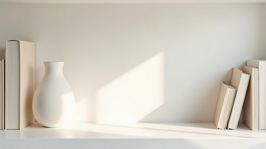
How light shapes what a bookshelf feels like
Good lighting doesn't announce itself. It settles into the room and changes how everything feels. A shelf in flat overhead light looks flat. The same shelf with a small directed lamp placed at one end looks layered, warm, intentional.
A puck light or small LED strip inside or above a shelf is one of the highest-return changes you can make for under twenty euros. It creates depth through shadow, which is exactly what a well-styled shelf relies on.
Natural light matters too. If your bookcase sits in a living room near a window, note where the light falls at different times of day. Place your most textured or reflective objects where light will find them.
Did you know?
Interior designers refer to the colour temperature of shelf lighting as a key styling variable. A warm white bulb at 2700K makes wood and ceramics glow amber and inviting. A cool daylight bulb at 5000K makes the same objects look clinical. Most residential bookshelves benefit from a source between 2700K and 3000K.
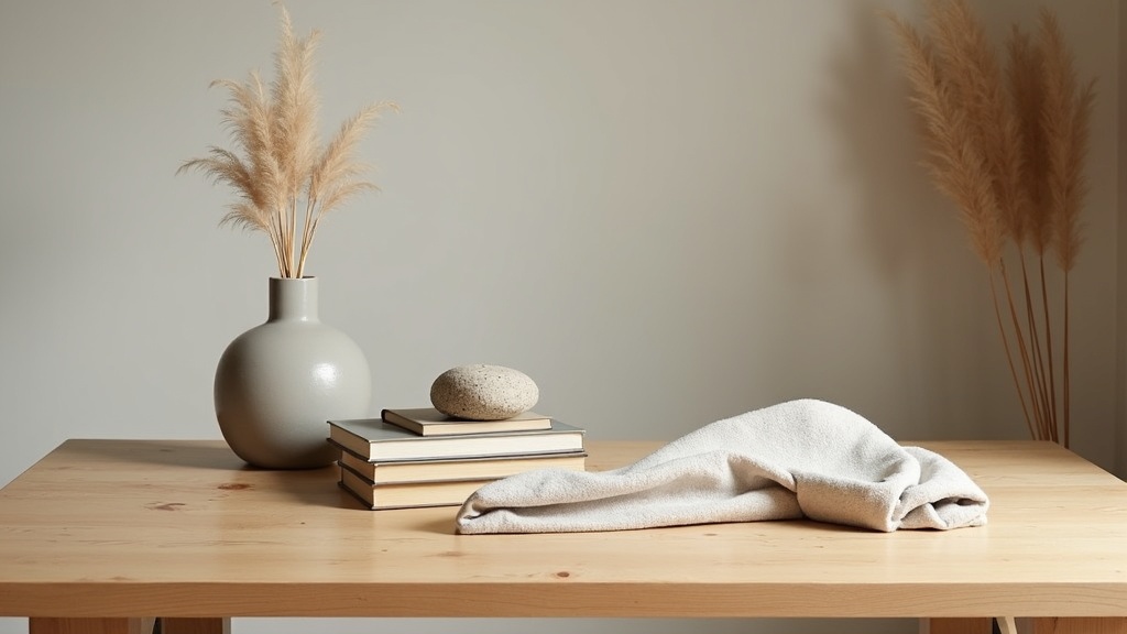
Styling a bookshelf without books (or with very few)
Not every shelf needs books. A bookshelf without books is simply an open shelf, and open shelf styling follows the same logic: objects earn their place, space is deliberate, texture does the work that words do elsewhere.
What replaces books
- Vessels of different heights: tall vases, small ceramic pots, a single sculptural bottle
- A framed artwork or print leaning against the back wall of one shelf, not hung, just resting
- Folded textiles: a linen throw, a folded wool blanket for visual softness and warmth
- Trays to anchor a grouping: a small stone or wooden tray corrals smaller objects and gives the eye a frame
- One plant, placed deliberately: a trailing pothos at shelf edge or a single stem in a narrow vase, not a collection
Decorating a bookshelf in an office
Office shelves need to balance function and calm. Keep practical items (notebooks, small organisers) in uniform containers so they read as one object, not many. Add one personal piece per shelf, a photograph, a small object from a trip, something that makes the space feel like yours without making it look cluttered.
The one rule that holds all of it together
Lagom. Not too much, not too little. Just enough, done with care.
Every decision in bookshelf styling comes back to restraint. Not minimalism for its own sake, but the specific, considered choice to stop before you've filled every gap. The shelf that looks designed is almost always the one where someone chose to leave something out.
When you stand back and it feels right, stop there. That feeling is the point.
Your starting checklist
- Empty the shelf completely before you begin
- Edit objects to a shortlist before placing anything
- Mix vertical and horizontal book arrangements
- Group in odd numbers, vary heights within each group
- Bring in at least two contrasting materials per shelf
- Leave one third of the surface deliberately empty
- Add a directed light source if overhead light is your only option
- Step back, look, and remove one more thing


