
A small room does not need to disappear into pale gray. It needs a point of focus, something to give it structure and draw the eye somewhere intentional. That is what the right accent wall actually does.
The color matters, yes. But the thinking behind it matters more. Here is what works, and why.
Key points at a glance
- An accent wall works in small rooms when it creates depth, not drama.
- Warm neutrals, dusty greens, and soft clay tones outperform stark white in many compact spaces.
- The wall you choose matters as much as the color itself: the far wall from the door is almost always the right one.
- Undertones decide everything. A beige with pink undertones behaves completely differently than one with yellow.
- Benjamin Moore and Sherwin-Williams both have specific shades that consistently perform well in small rooms.
- In 2026, warm stone and aged clay are replacing cooler greige as the go-to base for small interiors.
What this guide gives you
Why the 'Paint It White' Rule Misses the Point
White reflects light. That part is true. But in a small room, a fully white box rarely feels spacious. It usually just feels flat.
Without contrast, the eye has nowhere to land. Every wall reads the same. The room becomes shapeless rather than open.
A single accent wall changes that. It gives the room a back, a sense of layers. That layering is what the brain reads as depth.
How an Accent Wall Actually Changes the Feel of a Small Room
Color on one wall creates what designers call a visual anchor. The eye moves toward it and stops there. That controlled movement makes the room feel longer.
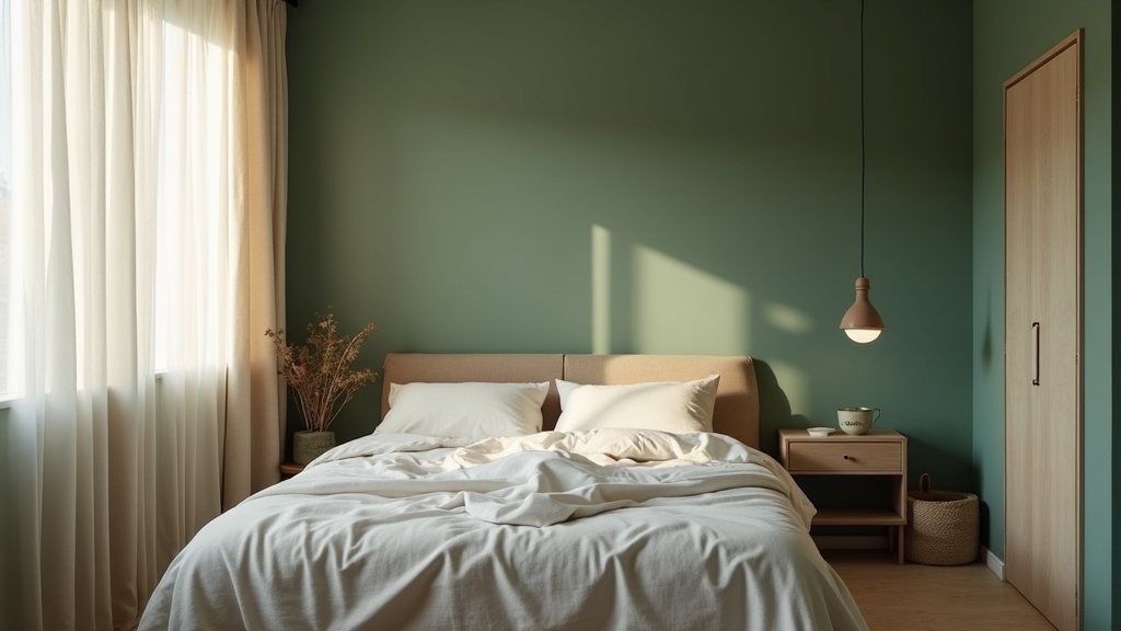
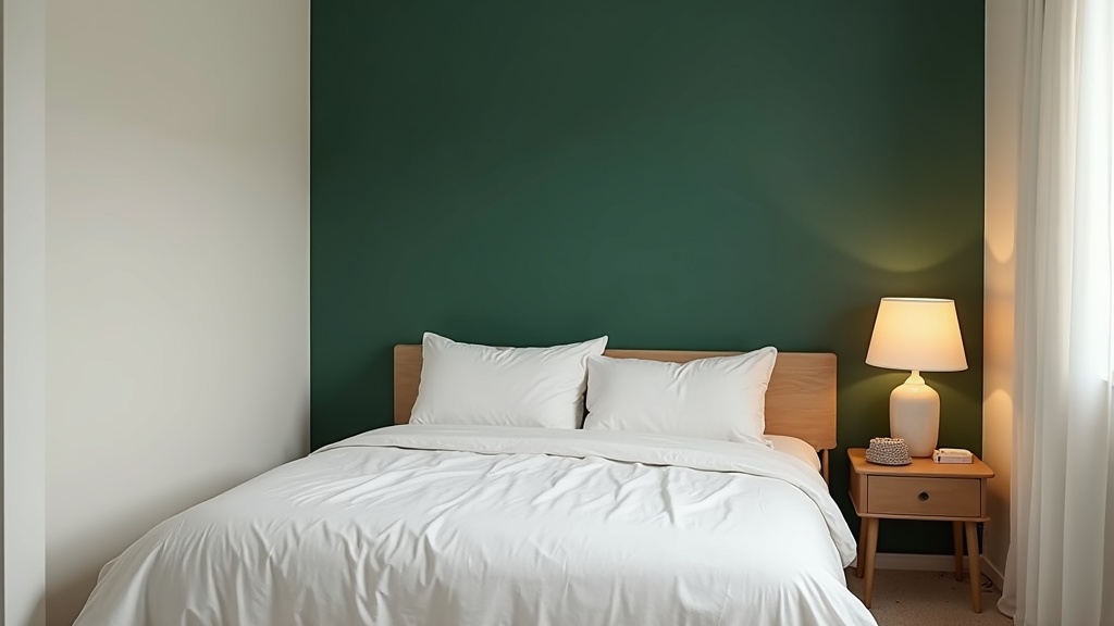
The effect works best when the accent wall is the one farthest from you as you enter. Your gaze travels the length of the room to reach it. That journey, even a short one, signals space.
Darker shades on that far wall actually pull it closer in the best possible way. The room reads as more intimate and defined, not smaller.
Did you know?
Research in environmental psychology shows that rooms with a defined focal point, such as one distinct wall, are consistently rated as more comfortable and more spacious than rooms with uniform color, even when the actual square footage is identical.
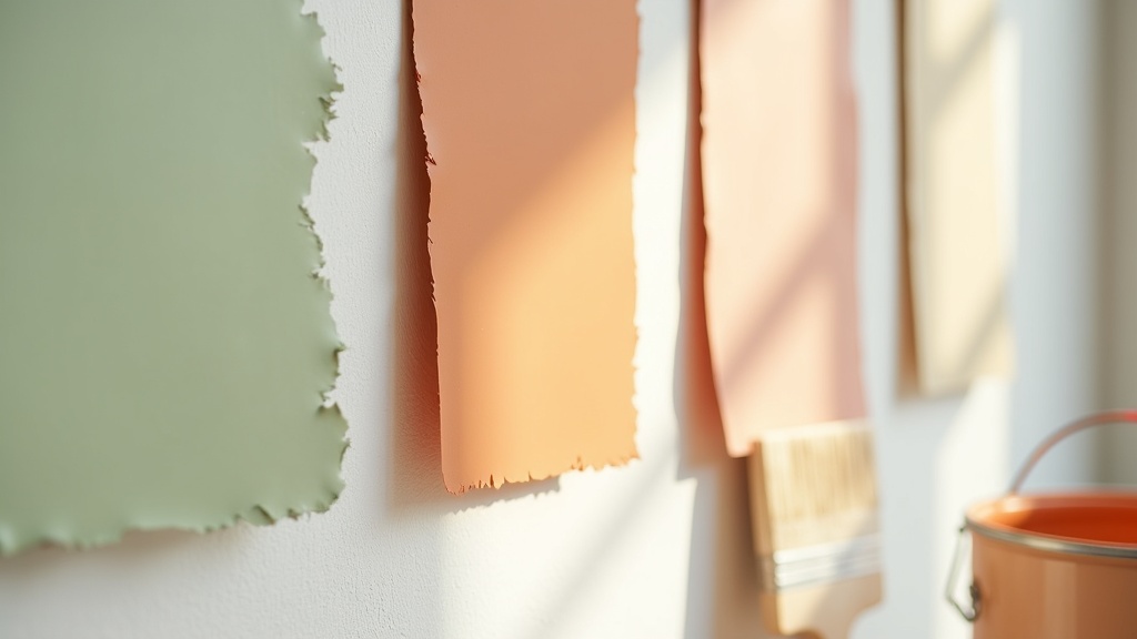
The Colors That Work Best: From Warm Neutrals to Quiet Darks
Not every color works equally well. The best accent wall colors for small rooms share a common trait: they have warmth without weight.
Warm neutrals
Think linen, oat, warm stone. These read as color without demanding attention. They warm the light in the room rather than absorbing it.
Dusty greens and sage
Sage green is one of the most reliable calming colors for small bedrooms. It reads as natural, sits quietly, and works across lighting conditions from golden afternoon to overcast morning.
Soft clay and terracotta
These tones borrow from the warmth of natural materials. On a single wall, a muted terracotta creates the feeling of a nook, of a room that wraps around you rather than closes in.
Quiet darks
Deep navy, charcoal, forest green: used on the far wall only, these read as depth, not heaviness. The key is keeping the other three walls light and the trim crisp.
Which Wall to Choose (and Why It Matters More Than the Color)
This is where most people go wrong. They pick the color first and the wall second. It should be the reverse.
- Far wall from the entry: almost always the best choice. The eye travels to it naturally.
- The wall behind a bed or sofa: creates an anchor for the furniture arrangement and makes the room feel intentional.
- A wall with a window: avoid this one. Color around a window flattens the light and makes the room feel smaller.
- Side walls in a narrow room: also avoid. Painting a side wall draws the eye sideways and makes the room feel even more pinched.
The rule of thumb: choose the wall that terminates your natural line of sight when you walk through the door. That is your accent wall.
Light Undertones, Warm Undertones: What to Look for Before You Commit
Undertones are invisible until they are not. A color that looks perfect on the chip can turn greenish, pinkish, or muddy on the wall, depending on your light source.
In small rooms, the light is often limited. This makes undertone selection more critical, not less.
North-facing rooms get cool, bluish light. Warm undertones (yellow, peach, red) compensate for this and keep the room from feeling cold.
South-facing rooms get generous, warm light all day. Cooler undertones work here. A sage with a gray base, a green with a blue lean, these will not go orange under afternoon sun.
Test with a large sample (at least A4 size) pinned to the actual wall. Look at it in the morning, at midday, and under artificial light in the evening. That is the only reliable test.
Did you know?
Standard LED bulbs (around 2700K color temperature) push yellow into every color on your wall. A paint chip tested under this light will look noticeably warmer than the same chip seen in daylight. Choosing a shade cooler than you think you want is often the right call when your room relies on artificial light.
Specific Paint Picks Worth Knowing: Benjamin Moore, Sherwin-Williams, and Beyond
These are not trends. They are colors with consistent track records in small spaces.
| Paint Name | Brand | Tone Family | Best Used On |
|---|---|---|---|
| Pale Oak OC-20 | Benjamin Moore | Warm greige | Any room, low-light spaces |
| Vintage Vogue 2162-40 | Benjamin Moore | Dusty lavender-gray | Bedrooms, calm accent walls |
| Sage SW 2860 | Sherwin-Williams | Muted green | Bedrooms, reading nooks |
| Accessible Beige SW 7036 | Sherwin-Williams | Warm neutral | Living rooms, small hallways |
| Nonchalant White OC-140 | Benjamin Moore | Creamy warm white | Surrounding walls alongside a dark accent |
| Rookwood Terra Cotta SW 2803 | Sherwin-Williams | Muted clay | Single accent wall, south-facing rooms |
For small house interiors as a whole, Benjamin Moore's Pale Oak and Sherwin-Williams Accessible Beige remain the most reliable base choices. Both have yellow-beige undertones that read as genuinely warm without going orange.
What Color Is Replacing Beige in 2026
Greige had a long run. It is not over, but it is being quietly displaced by something warmer and more textured.
Warm stone and aged clay are the tones showing up consistently in 2026 interiors. They read more complex than greige: slightly more pigment, slightly more personality, but still fundamentally calm.
Think of colors like Benjamin Moore's Pale Chestnut or Sherwin-Williams' Antique White used as a base, with a single wall in a deeper clay or dusty terracotta. The combination feels considered without being designed for an audience.
The shift reflects something broader: people want rooms that feel like they have been lived in, not rooms that photograph well and feel like nothing.
Small Room, Big Feeling: Putting It All Together
Here is how to make it work, step by step.
- Choose your wall first. Far wall from the entry, or the wall your furniture naturally faces.
- Pick a tone family. Warm neutral, sage green, quiet dark, or soft clay. Match it to your light direction.
- Check the undertone. Warm rooms need cool-leaning accents. Cool rooms need warm-leaning ones.
- Sample large. At least A4. On the wall. For three days, in different light conditions.
- Keep the other three walls light. A warm white or creamy neutral. Not bright white: that creates too much contrast and fragments the room.
- Let the trim breathe. Crisp, semi-gloss white trim sharpens the whole composition without adding visual weight.
Lagom applies here: not too much, not too little. One wall. One color. Done with attention. That is enough.


