
A feature wall is not a commitment to excess. It is a decision to be precise. One wall, handled with intention, can make a room feel larger, calmer, more lived-in, or more alive, without touching anything else.
These are the modern wallpaper ideas for feature walls that hold up past the first season. Not the loudest options. The ones that still feel right three years from now.
Key points at a glance
- One well-chosen wall does more than a fully papered room in most cases
- Texture-forward and organic prints are the strongest modern wallpaper trends heading into 2025 and 2026
- The best color for a feature wall depends on light direction, not just personal taste
- Small rooms benefit most from a single statement wall, especially in bedrooms and hallways
- Scandinavian wallpaper ideas favor restraint: one pattern, calm tones, materials that age well
- Hanging wallpaper on one wall is a manageable DIY project when the wall is properly primed
Why this guide works for you
Why a Single Wall Changes Everything
Papered walls on all four sides can feel heavy. One wall gives you everything you want from pattern and color, without asking the room to carry weight it cannot hold.
The feature wall creates a focal point. The eye needs somewhere to land. When it finds it quickly, the rest of the room feels more organized, even if nothing else has changed.
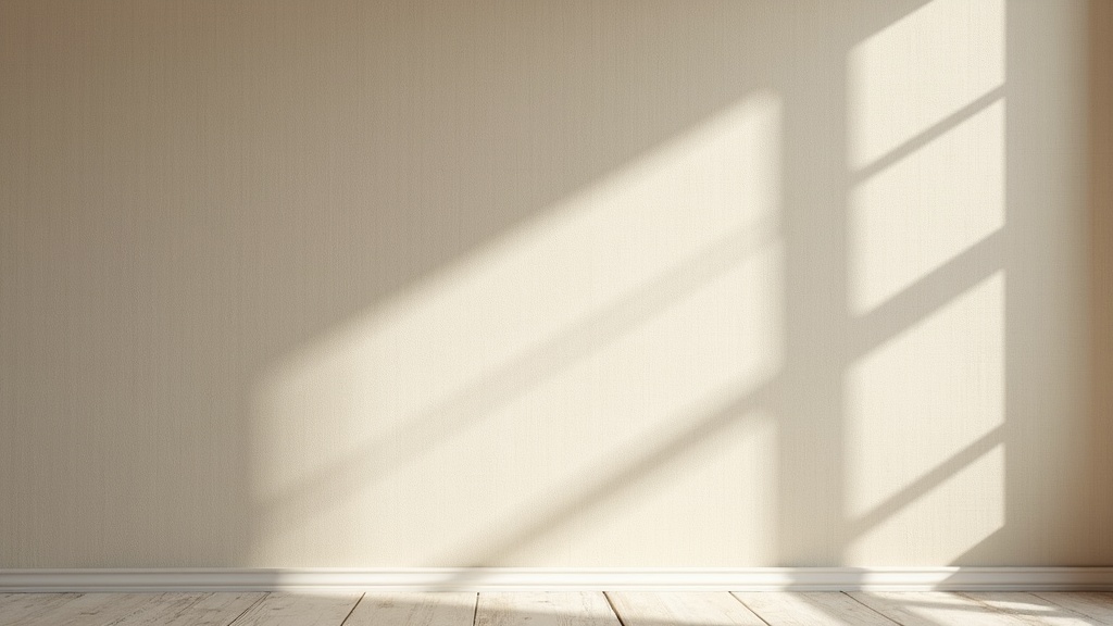
Light does the rest. A textured wallpaper on a north-facing wall catches the diffuse glow of morning. On a south-facing wall, it shifts with the sun across the day. The same paper behaves differently depending on where you put it.
What Wallpaper Trends Are Actually Worth Following Right Now
Modern wallpaper trends 2025 and 2026 are moving away from the maximalist botanical explosion of recent years. The new direction is calmer: organic texture, muted earth tones, and hand-drawn line work that references nature without replicating it literally.
Patterns worth investing in
- Linen and grasscloth textures: flat-woven looks that add depth without pattern repeat headaches
- Tonal stone and mineral prints: slate, travertine, warm concrete effects that sit quietly behind furniture
- Abstract botanical line drawings: sparse, not dense, on an off-white or clay ground
- Warm geometric repeats: arches, scallops, and soft hexagons in terracotta or sage
What is leaving: high-contrast tropical prints, bright maximalist florals, and anything that photographs well but exhausts a room in person.
Did you know?
Grasscloth wallpaper has been produced in Asia for over 400 years. The natural sisal, seagrass, or jute fibres are hand-woven onto a paper backing. Because each panel is a natural material, slight color variation between rolls is expected and considered part of the character, not a defect.
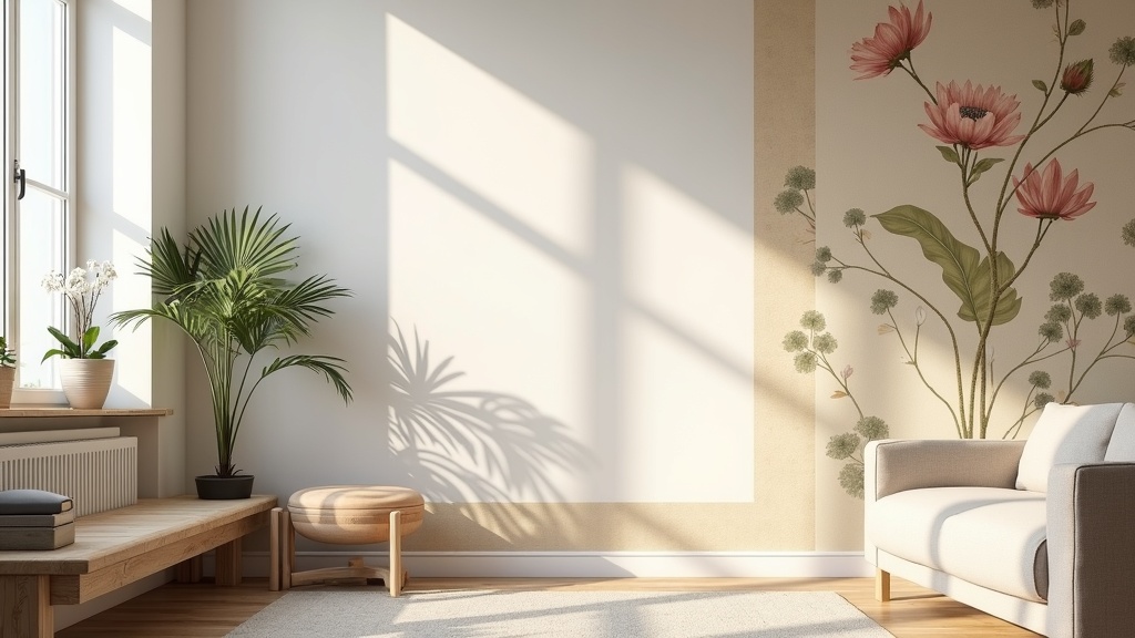
Living Room Feature Walls: Patterns That Hold Their Ground
The wallpaper accent wall in a living room is almost always the wall behind the sofa or the chimney breast. Both choices work. The logic is the same: the pattern should anchor, not compete.
In a living room, scale matters more than anywhere else. A small repeat on a large wall reads as texture from the sofa. A large-scale botanical or abstract print holds the eye from across the room without overwhelming.
Stick to three tones maximum across the whole room: the wallpaper counts as one of them.
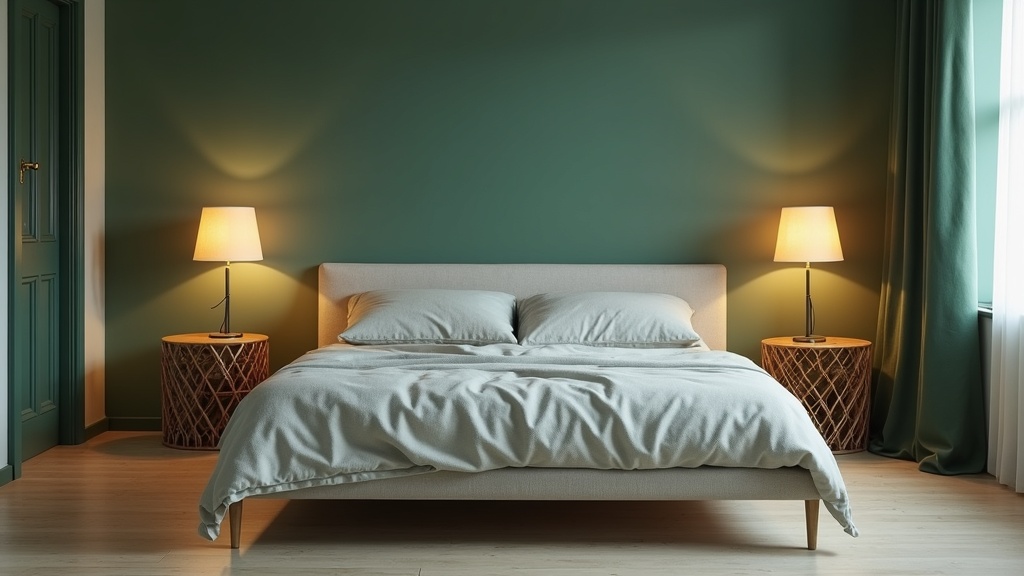
Bedroom Feature Walls: One Wall, the Right Mood
The one wall wallpaper bedroom almost always belongs behind the bed. It frames the headboard, gives the room a clear direction, and disappears into the background once you are lying in it looking at the ceiling.
For bedroom feature wall wallpaper, lean toward matte finishes and soft patterns. Sheen bounces light at night. A flat, slightly warm paper absorbs the low light from bedside lamps and makes a room feel settled rather than stimulated.
Dark wallpaper in a bedroom is not a mistake, done right. Navy, deep sage, and warm charcoal all create a cocooning effect that reads as restful, not gloomy, when the furniture stays light.
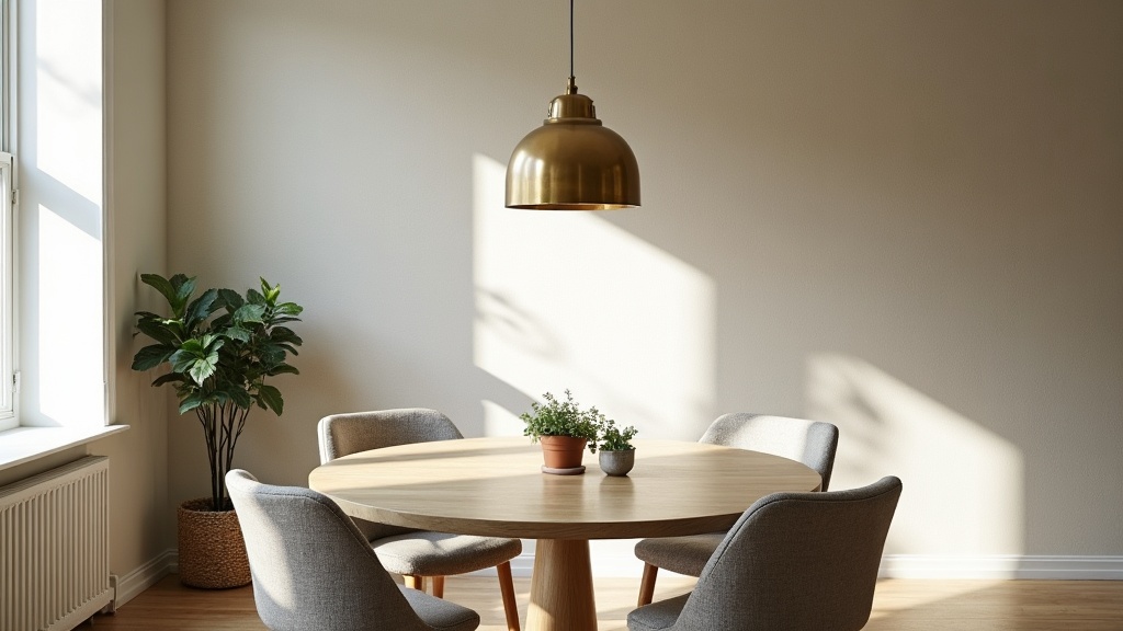
Dining Room and Hallway Walls: Small Spaces, Strong Impact
The wallpaper accent wall in a dining room works particularly well because people sit facing it for long stretches. A pattern that rewards a long look, something with subtle variation or hand-printed imperfection, earns its place here.
For small room feature wall wallpaper, the rule is counterintuitive: bolder works better than you expect. A large-scale print in a small hallway draws the eye upward and outward. A small fussy repeat just makes a small room feel busier.
Hallways specifically
- Choose a durable, wipeable finish, traffic is higher here than anywhere else
- Vertical stripe effects (including subtle textural ones) lift low ceilings visibly
- A rich, dark tone on the end wall of a corridor creates a sense of depth where there is none
Did you know?
Dark paint or wallpaper on the far end wall of a narrow hallway is a technique borrowed from theater set design. It uses the same principle as forced perspective: the eye reads the dark receding surface as further away than it is, making the corridor feel longer and more intentional.
Choosing the Best Color for a Feature Wall
The best color for a feature wall is not a universal answer. It is a function of how much natural light the wall receives, the undertones already in the room, and what the room is for.
| Light Direction | Tone to Favor | Tone to Avoid |
|---|---|---|
| North-facing | Warm whites, terracotta, ochre | Cool greys, icy blues |
| South-facing | Deep navy, forest green, rich plum | Very pale pastels (wash out) |
| East-facing | Soft sage, warm sand, blush | Stark white (harsh in AM light) |
| West-facing | Burnt orange, clay, warm stone | Bright yellow (amplified at dusk) |
| No natural light | Deep jewel tones, confident darks | Mid-range muddy tones |
Scandinavian wallpaper ideas tend to solve this problem elegantly: the palette does the work, not the pattern. A soft birch-bark print in warm off-white reads well in almost any light. That is the lagom approach. Not too much. Not too little.
What to Expect in Wallpaper Trends Heading Into 2026
The direction is quieter, more material-led. Expect more papers that mimic natural surfaces: lime wash, raw plaster, washed linen. The goal is a wall that looks considered rather than decorated.
- Tonal damasks in clay-on-clay or stone-on-stone, barely there but present
- Hand-painted effect papers with visible brushwork and deliberate imperfection
- Wabi-sabi influenced prints that celebrate asymmetry and irregularity
- Earthy monochromes: one color, multiple values, no high contrast
The rooms that will photograph well in 2026 are the rooms that feel good to be in today. That is the test worth applying.
How to Hang Wallpaper on One Wall Without Getting It Wrong
One wall is genuinely more forgiving than a full room. The joins are fewer. The pattern matching is simpler. But the preparation still decides the result.
Before you start
- Fill any holes and sand smooth. Texture in the wall reads through most papers
- Prime with a dedicated wallpaper primer, not standard emulsion. It controls absorption
- Let the primer dry fully. 24 hours minimum
- Start from the center of the wall and work outward, not from an edge
Common mistakes
- Skipping primer on new plaster (the paper will bubble or peel within months)
- Not accounting for pattern repeat when calculating how many rolls you need
- Rushing the seams while the paste is still wet
Order one extra roll. Always. Dye lots change between print runs, and if a seam lifts in two years, you want a matching repair.
The Quiet Test: Does Your Feature Wall Feel Right?
Sit in the room. Stay for ten minutes. Stop looking at the wall directly.
If the wall starts to disappear into the room, if it stops announcing itself and just belongs, that is right. The best feature walls are the ones you forget are there. You just notice that the room feels better than it did before.
If the wall keeps pulling you back, if it asks for attention it has not earned, that is the answer too. A pattern that demands to be seen every time you walk in will tire you out within a year. Go calmer. Go one tone warmer or cooler. Give it less.
Lagom is the guide here. Not too much. Not too little. Just enough, done well. That is the standard a feature wall should meet, and the standard the best modern wallpaper ideas for feature walls always clear.


