
Some rooms make you exhale the moment you walk in. That quality is not accidental. It comes from specific choices: the weight of a textile, the angle of a lamp, the silence of a palette that does not compete with itself.
Coastal interior design, when done well, is not about seashells on a shelf. It is about borrowing the sensory logic of shorelines: open space, soft light, natural materials, and a sense that nothing is forced.
Key points at a glance
- Coastal design is defined by texture, light, and restraint, not nautical props
- A sand, stone, and soft blue-green palette works in any room size or aspect
- Natural materials like linen, rattan, and jute carry the visual weight without clutter
- Light placement shapes the mood far more than wall colour alone
- Small coastal living rooms benefit from a single focal texture, not multiple competing ones
- You can achieve a coastal feel by editing what you already own, not replacing everything
Why this approach works
What Coastal Design Actually Means (and What It Doesn't)
Coastal interior design is not a theme. It is a sensibility. The reference point is the quality of light, space, and material you find near water, not the objects associated with the sea.
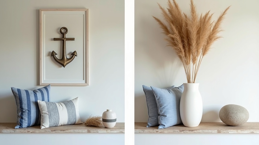
What it is not: rope handles, anchor motifs, blue-and-white stripes on every surface, or a drift of seashells arranged on a windowsill. Those details age quickly and signal effort rather than ease.
What it actually is: rooms that breathe. Low visual clutter. A palette drawn from the landscape rather than a mood board. Materials that feel honest. Light that arrives rather than blares.
The Color Palette: Sand, Stone, and Soft Water Tones
The coastal color palette for a living room works because it mimics the natural gradient from land to sea. It moves from warm to cool without jarring transitions.
The core three tones
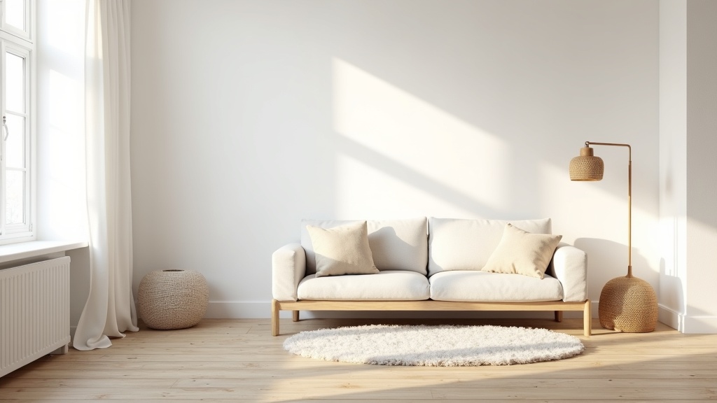
- Sand and warm white: walls, large textiles, ceiling. The base that everything sits against.
- Stone and driftwood grey: flooring, side tables, ceramic objects. Grounds the room without darkening it.
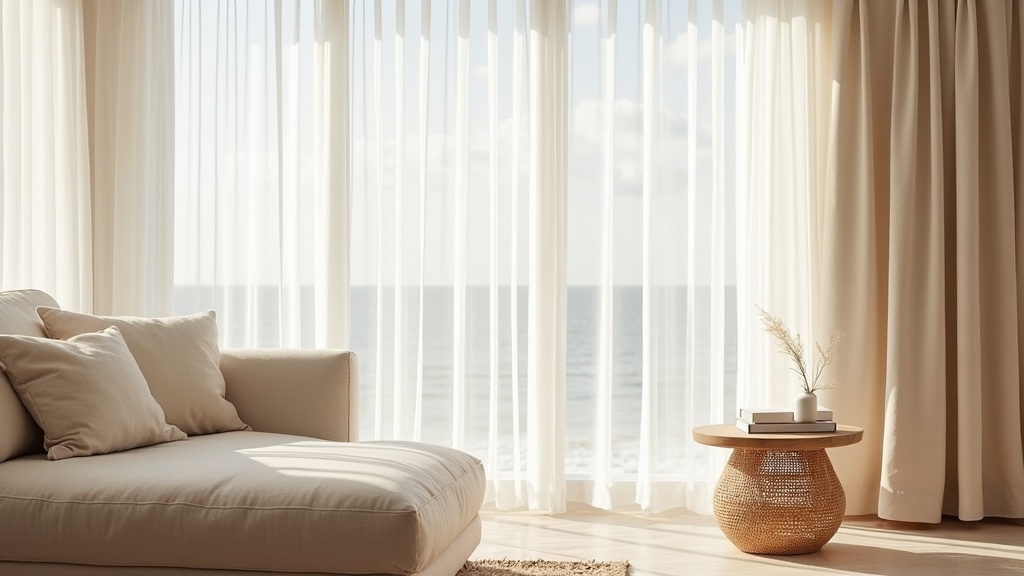
- Soft blue-green and sage: used in small doses. A cushion, a plant pot, a single throw. Not a painted feature wall.
The rule is simple. 80% warm neutrals, 20% muted cool tones. The moment you reverse that ratio, the room starts to feel like a hotel lobby rather than a home.
Did you know?
Research published in Color Research and Application found that rooms decorated in low-saturation blue and green tones are consistently rated as more relaxing than rooms in bright or high-contrast schemes. The coastal palette is not just aesthetic; it has a measurable effect on perceived calm.
Texture Over Pattern: Linen, Rattan, and Woven Materials
Pattern asks for attention. Texture rewards it. That is the difference, and it matters in a coastal living room.
When you layer linen upholstery, a jute rug, a rattan side table, and a chunky-knit throw, the room reads as rich without being busy. Each material catches light differently. The eye moves through the space and rests, rather than snagging on a bold print.
| Material | Best used for | Coastal quality |
|---|---|---|
| Linen | Sofas, cushions, curtains | Softens light, improves with age |
| Rattan | Side tables, pendants, chairs | Casts warm patterned shadow, feels light |
| Jute or sisal | Rugs, woven baskets | Grounds the space without visual weight |
| Whitewashed oak | Flooring, coffee tables, shelving | References driftwood, stays neutral |
| Ceramic or stone | Lamps, objects, vases | Adds grounded weight, matte finish preferred |
Light as a Design Tool, Not an Afterthought
Good lighting does not announce itself. It settles into the room and changes how it feels. In a coastal living room, the goal is to replicate the quality of shoreline light: diffused, warm, and coming from multiple directions at once.
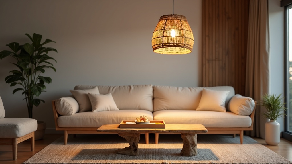
Avoid a single overhead ceiling light as your primary source. It flattens a room and removes all shadow, which is where depth lives. Instead, layer three levels: ambient (floor or table lamps), task (reading lamp near a chair), and accent (a lit shelf or small object light).
Sheer linen curtains are one of the highest-return decisions in this style. They filter direct sunlight into something soft and shifting. Light placed right does more for a room than any renovation.
Furniture That Feels Grounded Without Being Heavy
Coastal living room furniture sits low and leaves visual space above it. A sofa with visible legs reads as lighter than one that sits flush to the floor. A glass or rattan side table takes up almost no visual mass.
Principles to follow
- Choose pieces with tapered or slim legs where possible
- Keep the coffee table low: 35 to 40 cm is the coastal sweet spot
- Avoid upholstery in dark, saturated colours. Oat, ecru, and pale grey hold the palette
- One statement piece is enough. A curved linen sofa or an oversized rattan pendant, not both
For small coastal living room ideas, the logic sharpens. Every piece needs to earn its place. A slipper chair with a small footprint works harder than a bulky armchair. A narrow console behind the sofa replaces a coffee table in tight layouts.
How to Make a Living Room Look Coastal Without Buying Everything New
Start by removing, not adding. Pull out anything that reads as heavy, dark, or pattern-dense. What remains is often closer to coastal than you expected.
Five changes with immediate impact
- Swap curtains for unlined linen panels in off-white or warm sand
- Layer a jute rug over existing flooring to anchor the seating area
- Replace one lamp with a rattan or woven shade version
- Re-cover two cushions in a washed linen fabric in sage or soft blue-green
- Clear one surface entirely and leave it empty. That single edit shifts the whole room's tone
Did you know?
Studies in environmental psychology show that reducing the number of visible objects in a room by as little as 30% measurably reduces self-reported stress levels in occupants. The coastal design principle of restraint has a direct psychological basis, not just an aesthetic one.
Common Decorating Mistakes in Coastal Living Rooms
The most common one is overloading the palette with blue. Real coastal spaces are mostly neutral. Blue appears at the water's edge, not across every surface.
Other mistakes worth naming
- Too many nautical accessories: anchors, rope, model boats. They date the room and reduce it to a costume
- Glossy finishes: lacquered furniture or high-sheen paint reflects light harshly. Matte and satin are the correct choices
- Matching everything: a coastal room looks assembled over time, not bought in a single afternoon
- Ignoring the floor: a jute or wool rug is not optional. Without it, the room floats disconnected from itself
What Coastal Interior Design Looks Like in 2026
The direction in 2026 is quieter and more Nordic in influence. The coastal Scandinavian living room has become a defining reference: whitewashed wood, undyed linen, muted sage, a single ceramic object, and generous negative space.
Curves are relevant. Sofas with rounded arms, organic-shaped side tables, and arched floor lamps soften the room without introducing pattern. They echo the natural forms of stone and wave without being literal about it.
Sustainability also shapes the conversation. Reclaimed oak, undyed natural fibres, and handmade ceramics are not just aesthetic choices. They communicate an intention: this room was built to last, not to trend.
Start Here: A Practical Room Edit
You do not need to redesign the room. You need to make better decisions about what stays.
- Stand at the doorway and name every object you see. Anything you cannot justify in two words goes into a holding box for two weeks.
- Check your light sources. If you only have one overhead fitting, add a floor lamp before you do anything else.
- Look at your largest textile first. The sofa or the rug sets the palette. Everything else follows from there.
- Introduce one natural material you do not already have. Rattan, jute, and linen are the most accessible entry points.
- Leave one surface empty. A table, a shelf, a windowsill. Negative space is not wasted space. It is what makes the rest of the room readable.
Lagom: not too much, not too little. Just enough, done well. That is coastal design, and it works because it starts with how a room feels to be in, every day, not how it looks in a photograph.


