
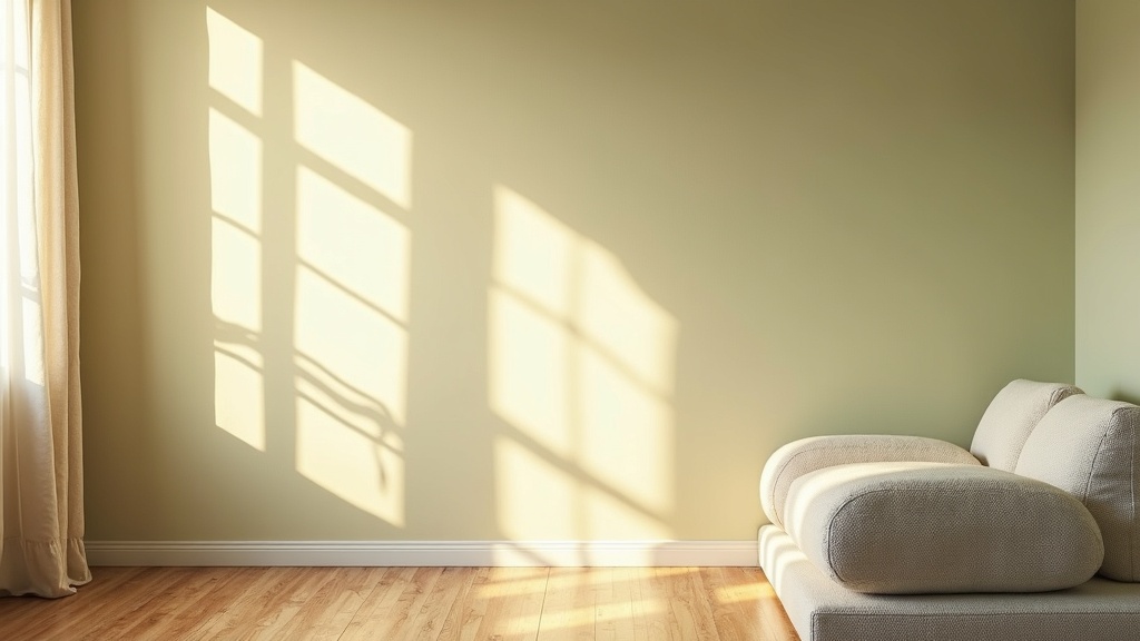
You chose the perfect color at the store. Then you painted the wall, stepped back, and wondered what went wrong. The color looked nothing like what you expected. Greener, flatter, somehow off.
Nothing went wrong with the paint. Something went right, actually: you noticed that light is doing most of the work. It always has been. Understanding how lighting affects room color perception changes the way you make every decision about a space.
Key points at a glance
- Light changes paint color throughout the day, and no two hours look the same.
- The direction your room faces shapes its color temperature and brightness year-round.
- Warm bulbs amplify yellows and reds; cool bulbs push greens, grays, and blues forward.
- Color Rendering Index (CRI) determines how accurately your bulb reproduces paint color.
- Always test paint samples under your actual light, at multiple times of day.
- Some colors are more stable across light conditions than others: knowing which ones saves costly repaints.
What you will take away
Color Does Not Live on the Wall Alone
Paint is a pigment. It has no color of its own. What you see is reflected light, filtered through the specific wavelengths your light source produces and the ones the pigment absorbs.
Move the light, and you move the color. It is that direct. The wall has not changed. The room has.
This is why choosing paint color for different lighting conditions is not an afterthought. It is the starting point.
The Science in Plain Terms: Why Light Changes What You See
Every light source emits a range of wavelengths. Daylight covers the full visible spectrum. Most artificial sources do not. Where a wavelength is missing or weak, the color that depends on it becomes muted or shifts toward something else entirely.
A warm amber bulb emits very little blue light. Put a cool gray paint under it, and the gray will look beige or even lavender. Put a white paint under it, and it will read cream. The pigment has not lied. The light has simply asked it a different question.

Natural Light: Morning, Midday, and Evening Are Three Different Rooms
Morning light is cool and slightly blue. It makes rooms feel crisp, sometimes cold. Colors read truer and a little more intense.
Midday light is neutral and bright. This is the closest natural light gets to a controlled reference. Colors show themselves most honestly at noon.
Evening light shifts warm: golden, amber, softening. Blues grow grayer. Warm tones glow. Whites turn golden. A room that felt calm at noon can feel genuinely cozy by 6pm, with no change at all except the sun's angle.
Did you know?
The color temperature of daylight shifts from roughly 10,000K at noon on an overcast day to as low as 1,800K at golden hour. That is a wider range than most people realize, and it is the main reason your room can feel like a completely different space from morning to evening without a single lightbulb turned on.
Which Direction Does Your Room Face? (It Changes Everything)
This is the question most people skip, and it shapes every color decision you will make for that room.
- North-facing rooms receive indirect, diffused light all day. The light is cool and consistent. Colors can look flat, and whites often appear slightly gray or blue.
- South-facing rooms get strong, sustained light across the day. Almost any color reads well here. Pale colors stay pale; bold ones stay bold.
- East-facing rooms are bright and warm in the morning, then dim and cool by afternoon. Great for energizing a bedroom or kitchen early in the day.
- West-facing rooms are dim in the morning and dramatic by late afternoon. Warm tones become extraordinary at sunset. Cool tones can look flat before 2pm.
Light direction and wall color are inseparable. A paint that looks beautiful in your south-facing showroom may look entirely different in your north-facing bedroom.
Warm vs. Cool Artificial Light: What Each Does to Your Paint
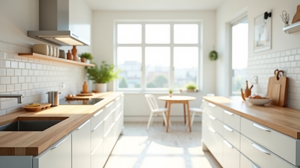
Artificial light paint color perception comes down, largely, to color temperature measured in Kelvins. Lower Kelvin numbers are warmer (amber, golden). Higher numbers are cooler (blue-white, daylight).
Here is what warm versus cool light does to the most common paint families:
| Paint Color Family | Under Warm Light (2700K) | Under Cool Light (5000K+) |
|---|---|---|
| White | Reads cream or ivory, feels cozy | Stays crisp, bright, can feel clinical |
| Gray | Shifts toward beige or taupe | Reads true gray or slightly blue |
| Blue | Turns muted, greenish, or gray | Stays vivid and saturated |
| Green | Deepens and warms, feels earthy | Brightens, reads more lime or aqua |
| Yellow / Ochre | Glows warmly, very rich | Can look harsh or slightly acidic |
| Terracotta / Red | Intensifies beautifully | Looks flat, loses warmth and depth |
Color Rendering Index: The Number Most People Ignore When Buying Bulbs
The Color Rendering Index (CRI) measures how accurately a light source reveals the true colors of objects, compared to natural sunlight. The scale runs from 0 to 100. Sunlight sits at 100.
Most standard LED bulbs sold in hardware stores have a CRI between 80 and 85. That sounds reasonable, but the missing 15 to 20 points show up in your paint. Colors look flatter, slightly off, or unexpectedly different from the sample card.
For home lighting where color decisions matter, aim for a CRI of 90 or above. High-CRI bulbs cost a little more. They make a visible difference, and you will not need to repaint to feel it.
Did you know?
Museums and art galleries almost universally use bulbs with a CRI of 95 or higher to ensure that painted works appear as the artist intended. The same principle applies to your walls: a high-CRI bulb is what separates the color you chose from the color you actually live with.
How to Test a Paint Color Under Your Actual Light (Not the Store's)
The store has bright, neutral fluorescent or daylight lighting. Your living room almost certainly does not. Testing at the store tells you what the color looks like there. It tells you almost nothing about your room.
Here is a simple process that works:
- Order sample pots and apply a generous patch directly on your wall, at least 30 x 30 cm.
- Paint two coats so the wall beneath does not read through.
- Observe the patch at three distinct moments: morning, midday, and evening with your artificial lights on.
- Step back and look from across the room, not just up close.
- If the color works at all three moments, it will work for the space.
A Few Colors That Behave Predictably Across Different Light Conditions
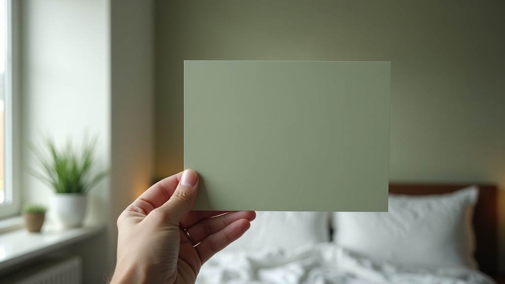
Some colors are reliable performers. They do not lurch between two entirely different identities as the light shifts. If you want a color that holds its character across morning, evening, and artificial light, these families are worth your attention.
- Warm whites with a yellow or pink undertone: They stay in a comfortable, readable range across most light temperatures.
- Earthy mid-tone greens: Sage, olive, and muted khaki tend to behave well under both warm and cool light, shifting in saturation rather than hue.
- Warm mid-grays with brown or red undertones (greige): More stable than cool blue-grays, which can swing dramatically.
- Terracotta and clay tones: Warm light flatters them; cool light keeps them readable. They rarely go wrong.
Colors to handle with care: pure cool grays, lavenders, and anything with a strong blue undertone. These shift the most under warm artificial light, often becoming unrecognizable by evening.
Working With Light Instead of Fighting It
Good lighting does not announce itself. It settles into the room and changes how everything feels. The same is true of color chosen with light in mind: it simply belongs there, at every hour.
A few practical principles to carry forward:
- In north-facing rooms, choose warm undertones to counteract the cool, flat light. Avoid pure whites and cool grays.
- In south-facing rooms, almost anything works, but be careful with very warm, saturated colors at midday: they can feel overwhelming.
- Match your bulb temperature to your intention: 2700K to 3000K for warmth and comfort, 4000K for kitchens and workspaces, 5000K only where you genuinely need task clarity.
- Upgrade to CRI 90+ bulbs before repainting a room. You may find you do not need to repaint at all.
- Use multiple light sources at different heights. A single overhead fixture flattens color. A floor lamp, a table lamp, and a wall sconce together give the room dimension.
Lagom applies here, as it does everywhere: not the most dramatic color, not the strongest light, not the most complex scheme. Just the right combination, considered carefully, so the room feels like exactly what it should.


