
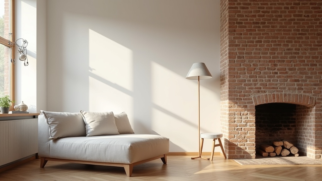
Every room comes with a fixed set of facts. A chimney breast that breaks the wall. A ceiling that sits lower than you'd like. A window placed somewhere inconvenient, or a structural column standing exactly where your sofa wants to go. These things are not problems. They are the room.
The difference between a space that feels assembled and one that feels right is almost always this: someone read the room before they bought anything. Designing around architectural features is not a workaround. It is the design.
Key points at a glance
- Read your room's fixed elements before choosing a single piece of furniture or paint color.
- Fighting awkward features costs money and rarely works. Working with them costs nothing.
- Lighting is the most underused tool for reshaping how architecture feels.
- Furniture placement should respond to the room's structure, not ignore it.
- Small interventions, a rug, a curtain, a shelf, can resolve tension without renovation.
- Renters and those on tight budgets have more options than they think.
What this approach gives you
Start with what the room is already telling you
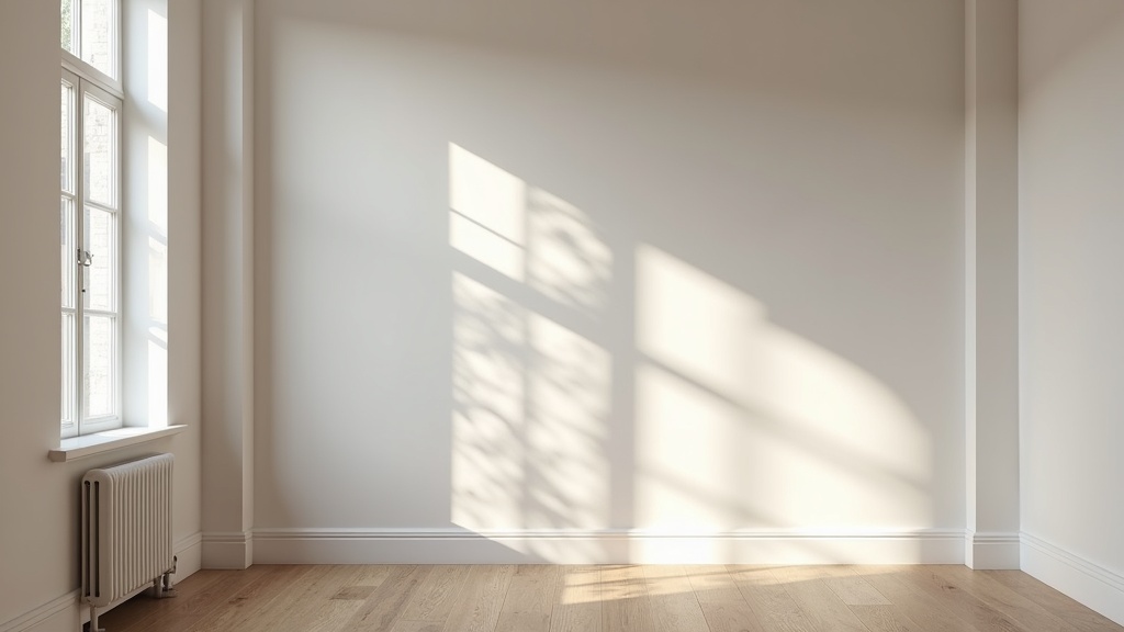
Before measuring for a sofa or picking a paint swatch, stand in the empty room and just look. Where does the light land? What does the eye move toward? Where does it stall?
Every room has a logic. Ceiling height, window placement, and structural walls all create an invisible structure that your furniture either follows or argues with. The rooms that feel good, the ones you remember, are the ones where everything seems to belong. That is not luck. That is someone paying attention at the beginning.
Write down three things the room does naturally well and three things that create friction. That list is your brief.
The features most people fight (and why that rarely works)
Low ceilings. Chimney breasts that break a wall. Alcoves that seem too narrow. Exposed pipework in a conversion. Most people try to hide these things or work around them as though they were mistakes.
But hiding a chimney breast with a flat false wall costs money, reduces floor area, and produces a room that feels slightly dishonest. Painting a low ceiling white to make it feel higher often just makes it feel clinical and still low.
The features that trip people up most often
- Low ceilings: fight them with vertical lines, not pale paint alone
- Chimney breasts: embrace the asymmetry, use it as a focal point
- Off-center windows: balance with furniture groupings rather than symmetry
- Awkward alcoves: built-in shelving almost always resolves them
- Exposed structural columns: treat as sculptural elements, not obstacles
The principle is the same each time. Work with the feature's actual nature. A low ceiling creates intimacy. Let it. A chimney breast creates a clear anchor for the room. Use it.
Did you know?
The average ceiling height in UK Victorian terraced houses is around 2.7 meters, noticeably lower than modern building standards of 2.4 meters for new builds but higher than many post-war properties. Rooms built before 1900 were often designed with the assumption that gas light and fires would create an upward draft, meaning their proportions respond better to warm, layered lighting than to overhead fluorescent sources.
How lighting shifts the conversation with any architectural element
Good lighting does not announce itself. It settles into the room and changes how it feels. This is where most rooms are let down, not by wrong furniture, but by a single ceiling pendant working too hard.
Light placed strategically does more for a room than any renovation. A low ceiling lit from the walls, with floor lamps and table lamps doing the work, stops reading as low and starts reading as cocooning. A dark alcove with a recessed uplighter inside it becomes a feature, not a shadow.
Practical lighting moves for difficult features
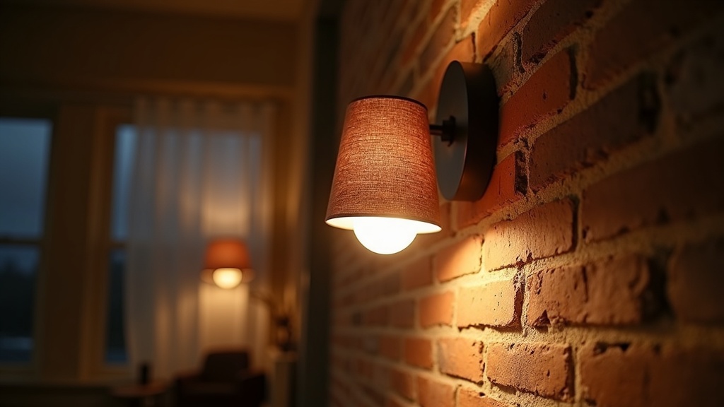
- Wash a textured wall (exposed brick, rough plaster) with a grazing light to emphasize depth
- Place a floor lamp in the corner furthest from the window to expand perceived room size at night
- Use picture lights or directional spotlights to draw the eye to architectural details worth keeping
- Avoid overhead-only lighting in rooms with low ceilings: it flattens the space
Furniture placement as a response, not a default
Most people push furniture to the walls. It feels safe and it maximizes floor space. But it often creates a room that feels disconnected, with objects arranged around a void rather than around each other.
Let the room's architecture direct placement. If there is a chimney breast, that is the anchor. The sofa faces it. The seating group organizes around it. If there is an awkward column mid-room, build a reading corner around it rather than apologizing for it with a clear path.
In Scandinavian interior design, furniture is placed to create relationships between people and space, not just to fill a footprint. A small sofa and two chairs grouped closely feels more generous than a large corner unit squeezed against four walls.
Color and material choices that let structure breathe
Color does not have to solve problems. It should support what is already there.
Painting a chimney breast in a deeper tone than the surrounding walls makes it purposeful. It says: this is here by design. Painting everything the same flat white can make structural elements look like accidents.
| Feature | Highlight approach | Soften approach | When to leave alone |
|---|---|---|---|
| Chimney breast | Deeper wall color, open shelving flanking it | Match to surrounding wall, use as media wall | When the room is already busy |
| Low ceiling | Lean into intimacy with warm tones, cocooning furniture | Vertical stripes, tall shelving, floor-to-ceiling curtains | When the room is used for relaxation, not work |
| Exposed beams | Natural oil finish, contrast with white ceiling | Paint to match ceiling in low rooms | When they are the room's strongest feature |
| Alcove | Built-in shelves, accent wall color inside | Single piece of furniture tucked in | When used as storage behind a curtain |
| Structural column | Wrap in wood slats or contrasting paint | Match to walls, place furniture close to it | When it genuinely reads as sculptural already |
Materials work the same way. A rough plaster wall next to smooth linen upholstery creates a conversation. That contrast is what makes the room feel considered, not decorated.
When to highlight, when to soften, when to leave alone
Not every feature needs a response. That is the lagom principle in practice: not too much, not too little. Just enough, done well.
Ask yourself whether the feature earns attention. A beautiful original cornice earns it. A slightly awkward internal support column in a modern flat probably does not need a spotlight. Sometimes the right choice is to make something neutral so the room's better qualities lead.
Did you know?
In Swedish design culture, the concept of lagom, meaning roughly "just the right amount," was reportedly coined by Vikings sharing a communal drinking horn around a fire. Whether or not the etymology holds, the principle shapes how Scandinavian designers approach every decision: restraint is not a limitation, it is the method.
Small interventions with lasting effect: rugs, shelving, curtains
A rug defines a zone. In a room where structural elements break the floor plan in unexpected ways, a well-placed rug brings cohesion. It tells the eye where the seating group begins and ends, regardless of what the walls and ceiling are doing.
Floor-to-ceiling curtains hung close to the ceiling (not at window height) make any window feel taller and any room feel more generous. This costs the same as a regular curtain. The return is disproportionate.
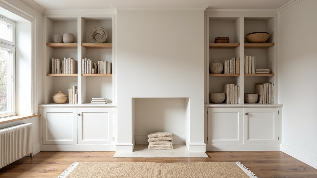
Shelving built into alcoves or fitted around a chimney breast converts dead space into storage and turns a potential awkwardness into the room's most purposeful moment. It does not require a carpenter. Ready-to-assemble systems work well when the depth and finish are chosen with the room in mind.
Renting or on a budget: working with features you cannot touch
Renting removes certain tools. You cannot paint, you cannot build, you cannot fix anything to the wall in many cases. But the core principles remain.
- Freestanding shelving in alcoves creates the same visual effect as built-in without a single screw
- Curtain tension rods allow floor-length curtains without wall fixings in some setups
- Large rugs are the single highest-return investment in any rented space
- Removable peel-and-stick wallpaper can give an alcove a different tone without permanent change
- Furniture groupings that reference the architecture work regardless of ownership status
The budget constraint also clarifies thinking. When you cannot do everything, you identify what actually matters. Usually it is light, proportion, and one or two materials that feel right in the hand.
A simple process for reading your space before you buy a single thing
This is the part most people skip. They buy the sofa, then arrange the room around it. The room usually loses that argument.
Take one hour with an empty room, natural light only, and work through this sequence:
- Map where the light moves from morning to evening. That determines where to sit, work, and sleep.
- Identify the room's one strongest feature, the element that makes it specific. That becomes your anchor.
- List the features that create friction and decide for each: highlight, soften, or neutralize.
- Draw a rough floor plan with furniture placed in response to the architecture, not along the walls by default.
- Buy lighting last, or next to last. Once the furniture is in place, you see exactly where shadow falls and where warmth is missing.
The best rooms are not the ones where everything matches. They are the ones where everything makes sense. That kind of sense starts with listening to the room before you speak.


