
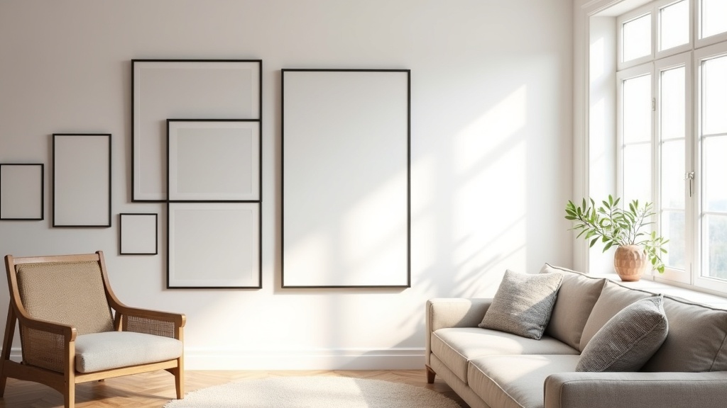
A gallery wall either feels considered or it feels restless. There is rarely a middle ground. Most of the ones that feel off share the same problem: they were built by adding, when they should have been built by editing.
The good news is that how to style a gallery wall correctly is less about rules and more about intention. Get the logic right first. The rest follows naturally.
Key points at a glance
- Choose the wall before you choose the art: scale and light come first.
- A cohesive gallery wall needs one unifying element, not matching frames.
- Spacing of 5 to 8 cm between frames keeps the arrangement readable without feeling sparse.
- Plan the layout on the floor before touching a single nail.
- Start hanging from the centre or the largest piece outward, never from a corner.
- The most common mistake is hanging everything too high.
What you will take away from this guide
Why Most Gallery Walls Feel Off (And What's Actually Missing)
Walk into a room with a gallery wall that works and you will not immediately think about the frames. You will feel the wall before you read it. That feeling comes from visual tension held in balance: enough variety to be interesting, enough restraint to be calm.
Most gallery walls that feel wrong are not missing more art. They are missing a decision. A clear point of view about what belongs and what does not.
Choose Your Wall Before You Choose Your Art
Start with the wall, not the collection. Ask yourself: how much natural light does it get? What is already nearby, a sofa, a console, a doorframe? What dimensions are you actually working with?
A wall in direct morning light reads differently at noon. A gallery wall above a low credenza sits differently than one on an open expanse. These conditions shape which pieces feel right.
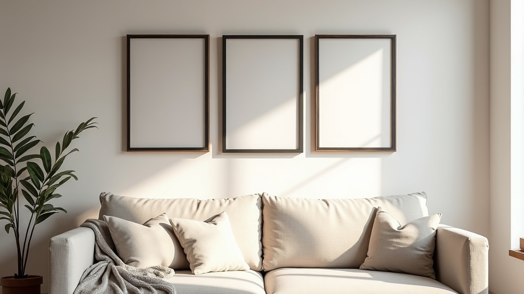
For gallery wall layout ideas in the living room, the most reliable anchor is the sofa wall. It gives the arrangement a clear floor reference and a natural horizontal baseline to build from.
How to Build a Cohesive Mix: Frames, Sizes, and Subjects
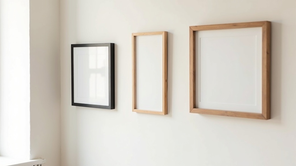
You do not need matching frames. You need one unifying thread. That thread might be colour (all frames in tones of black, brass, or natural wood). It might be mat colour (all white mats). It might be subject matter (all botanicals, all architecture, all family).
Frame mixing that holds together
- Limit frame finish variations to two or three tones maximum.
- White or off-white mats create visual breathing room between very different styles.
- Vary frame width as well as size: a thin frame next to a chunkier one adds rhythm.
- One or two frameless pieces (mounted prints, canvas) keep the arrangement from feeling too formal.
On subjects and eclectic gallery wall ideas
Eclectic does not mean random. A black-and-white photograph next to a loose ink sketch can work beautifully if the mood of both is quiet. Tone and feeling matter more than medium.
Did you know?
The human eye naturally groups objects that share a visual similarity, a principle called the Gestalt law of similarity. Applied to gallery walls, this is exactly why one shared element (frame colour, mat tone, subject palette) makes a disparate collection read as a whole rather than a pile of separate pieces.
The Spacing Rule That Changes Everything
Five to eight centimetres between frames. That is the range that feels intentional without feeling crowded. Less than four centimetres and the arrangement looks accidental. More than twelve and the pieces start to feel like separate artworks that happened to land on the same wall.
Keep spacing consistent throughout the arrangement. The exact number matters less than the consistency. An even gap of six centimetres everywhere reads as calm. Gaps that vary between three and fifteen centimetres read as unfinished.
| Gap Between Frames | Visual Effect | Best Suited For |
|---|---|---|
| 3 cm or less | Dense, almost collage-like | Staircase walls, maximalist rooms |
| 5 to 8 cm | Cohesive, intentional, readable | Living rooms, bedrooms, hallways |
| 10 to 12 cm | Airy, slightly formal | Large walls with fewer, bigger pieces |
| Over 15 cm | Disconnected, unintentional | Generally to avoid in gallery arrangements |
How to Plan Your Layout Before a Single Nail Goes In
This is the step most people skip. It is also the one that matters most. Gallery wall template planning on the floor takes twenty minutes and saves hours of patching holes.
The floor method
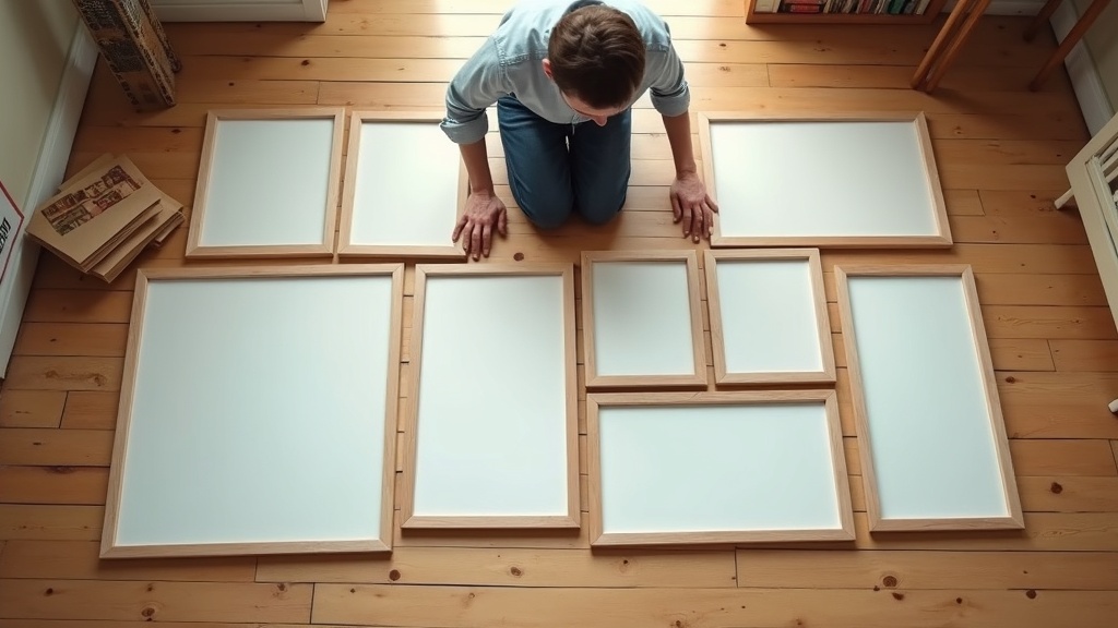
- Lay all your frames face-up on the floor in the rough shape of your wall area.
- Step back and look from standing height. Your eyes will find the problems immediately.
- Trace each frame onto kraft paper, cut it out, and tape the paper shapes to the wall with masking tape.
- Live with the paper layout for a day. Adjust freely before committing.
The paper template step is not optional if you want to get this right the first time. It costs nothing and shows you exactly where the balance is off before anything is permanent.
Hanging Order: Where to Start and Why It Matters
Start from the centre, or from the largest piece if your layout has a clear anchor. Work outward in all directions. Never start from a corner or an edge.
If you start from the outside, you will box yourself in. The centre piece then has to fit whatever space is left, and it almost never does cleanly.
The eye-level rule
The visual centre of the arrangement should sit at approximately 145 to 152 cm from the floor. This is average eye level for an adult standing. It is not the top frame, not the bottom frame: it is the midpoint of the whole group.
Most gallery walls are hung too high. Bring the whole arrangement down by five to ten centimetres more than feels instinctive and the room will suddenly feel more grounded.
Did you know?
Museum curators typically hang the centre of artwork at exactly 152 cm (60 inches) from the floor. This height was established because it places the focal point at average adult eye level and reduces neck strain during extended viewing. The same principle applies directly to home gallery walls.
Common Gallery Wall Mistakes Worth Knowing Before You Begin
These come up again and again. None of them are catastrophic, but catching them early saves time.
- Hanging everything too high. The most common mistake by a significant margin.
- Using too many frame sizes that are all similar. Five frames that are all roughly 20x25 cm feel repetitive. Mix in at least one piece that is clearly larger or clearly smaller.
- No visual anchor. An arrangement of only small frames with no dominant piece floats and never settles.
- Inconsistent spacing. Even one rogue gap breaks the logic of the whole composition.
- Ignoring the furniture below. A gallery wall above a sofa should begin about 15 to 20 cm above the sofa back, not float halfway up the wall on its own.
- Forcing symmetry that does not belong. Perfect symmetry can work, but it requires very deliberate, matched pairs. Asymmetric layouts are more forgiving and usually feel warmer.
Are Gallery Walls Still Worth Doing in 2025 and 2026?
Yes. The trend conversation is mostly noise. A wall covered in things you genuinely care about will not look dated. What does look dated is a wall covered in things chosen to look like a gallery wall.
The distinction matters. Choose pieces for their meaning or their quiet visual quality. Let the arrangement reflect the room, not the algorithm.
In 2025 and into 2026, the shift is toward fewer, larger pieces mixed with one or two smaller works, away from the 20-frame everything-everywhere approach. Restraint is back. Lagom, not too much, not too little, is a useful lens here.
The One Question to Ask Before You Call It Done
Step back to the other side of the room. Look at the wall for ten seconds, then look away. Ask yourself: did the wall feel settled, or did my eye keep searching?
A finished gallery wall should not demand attention. It should reward a glance and release you. If something keeps snagging your eye in a way that feels uneasy rather than interesting, trust that feeling. One adjustment, a spacing correction, a removed piece, a swapped frame, usually resolves it.
The best gallery walls are the ones you stop actively noticing after a week. Not because they disappear, but because they simply belong.


