
A mantel is the one surface in a room that everyone looks at. And yet, it is usually the one that quietly unsettles a space, a little too crowded, a little too symmetrical, or simply missing a sense of intention.
Getting it right is not about more pieces. It is about understanding proportion, restraint, and the way light moves across a surface. Once you feel that, the mantel arranges itself.
Key points at a glance
- Start with one strong anchor piece, then build outward with restraint
- Height, depth, and negative space work together, not in isolation
- Light placed intentionally changes how every object reads on the shelf
- When a TV sits above, keep the mantel even quieter to avoid visual noise
- Texture matters more than quantity: two interesting materials beat six average ones
- The five most common mistakes are easy to spot once you know what to look for
What this guide gives you
Why Most Mantels Feel Off (And How to Fix It)
Most mantels feel off for a simple reason: they were arranged, not designed. Objects were placed one by one until the shelf looked full, rather than composed.
The fix is not subtraction alone. It is thinking about the mantel as a single composition, where every element has a relationship with the others, and with the empty space between them.
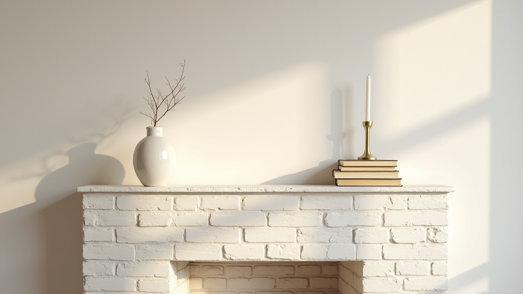
Start With One Anchor Piece, Then Build Out
Every well-styled mantel has one dominant piece that everything else relates to. A tall mirror, a wide piece of framed art, or a single large ceramic vessel. Start there.
Once your anchor is placed, slightly off-centre tends to work better than perfectly centred, add one or two smaller pieces that echo its weight without competing. Then stop.
What makes a good anchor piece?
- It has enough visual weight to hold the eye
- Its scale relates to the mantel width, not just the fireplace opening
- It has a material quality that rewards close attention: rough stone, aged wood, handthrown ceramics
Did you know?
In Scandinavian design tradition, the concept of lagom, roughly translated as just the right amount, has influenced how Nordic homes approach display surfaces for over a century. It is not minimalism for aesthetic reasons. It is the belief that restraint creates room for what matters to be noticed.
How to Use Height, Depth, and Negative Space Together
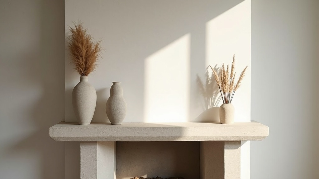
Height variation prevents a flat, static shelf. Group objects so that taller pieces lean toward one side and shorter ones step down from there. A gentle diagonal feels natural where an even row of mid-height objects does not.
Depth matters too. Pull some objects forward, push others back. That small variation in the z-axis creates shadow and dimension, making a two-dimensional shelf feel like a considered scene.
And negative space, the parts of the mantel with nothing on them, is not wasted. It is where the eye rests. Without it, the composition has no rhythm.
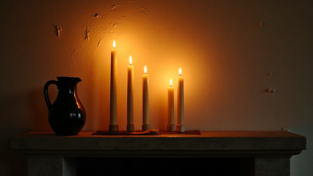
The Right Way to Layer Light on a Mantel
Good lighting does not announce itself. It settles into the room and changes how it feels.
On a mantel, two or three candles at different heights do more than any statement lamp. They cast moving shadows, soften the edges of harder objects, and give the composition warmth that no overhead light can replicate.
A small table lamp placed at one end of a wide mantel, just off the shelf itself on a side table or hearth, can frame the whole arrangement without sitting in it. Light placed right does more for a room than any renovation.
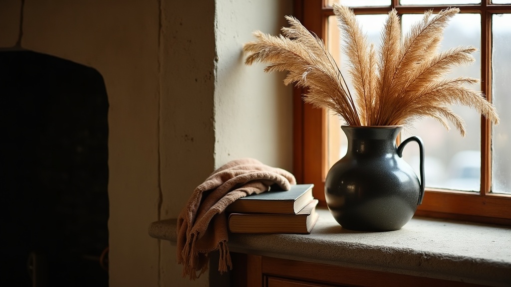
Texture Over Quantity: Choosing Materials That Work
Two objects with genuinely interesting surfaces will always outperform six objects that are merely decorative. The rule is simple: choose fewer things, and make sure each one earns its place through material quality.
The best combinations work through contrast. Matte against glossy. Rough against smooth. Organic against geometric. A raw concrete vessel beside a polished brass candlestick. A bundle of dried eucalyptus beside a clean marble block.
| Material | Best paired with | Mood it creates |
|---|---|---|
| Raw ceramic | Aged brass or dark steel | Warm, grounded, tactile |
| Pale marble | Dark matte stone or linen | Calm, refined, cool |
| Dried botanicals | Smooth glass or ceramic | Organic, seasonal, light |
| Reclaimed wood | White plaster or iron | Rustic, honest, sturdy |
| Polished brass | Natural stone or paper | Elegant, vintage, rich |
How to Style a Mantel With a TV Above It
A TV above a fireplace creates a real challenge. Two dominant focal points fighting for attention on the same vertical axis. The solution is to let the mantel recede.
When the TV is on, the mantel should disappear into the background. When the TV is off, it becomes the focal point again. That means fewer objects, lower heights, and nothing that competes visually with the screen frame.
Practical rules for TV-above mantels
- Keep all objects below one-third the height of the TV
- Use only two or three pieces, spaced generously
- Avoid art or mirrors that draw the eye upward, the TV already does that
- Choose matte and earthy finishes that absorb light rather than reflect it
Did you know?
Eye doctors and ergonomics specialists generally recommend that a TV screen should sit at or slightly below seated eye level for comfortable viewing. Mounting above a fireplace often places the screen 15 to 20 degrees higher than ideal, which is why the mantel styling below it matters even more: it should anchor the eye downward, not compete with the screen above.
Seasonal Updates That Feel Considered, Not Themed
Changing a mantel with the seasons is one of the most rewarding ways to keep a room feeling alive. The risk is tipping into theme-park territory: tiny pumpkins in October, red baubles in December, tulips in April.
The better approach is to change materials and textures, not motifs. In autumn, swap a linen runner for a felted wool one, replace lighter ceramics with darker stoneware, bring in a stem of dried seedheads. The mood shifts without announcing itself.
Five Mistakes Interior Designers Always Spot
These are the things that quietly undermine a mantel, even when everything else looks right.
- Perfect symmetry: two matching candlesticks, centred art, mirrored objects on either side. It reads as formal and static. Off-centre arrangements feel more alive.
- Too many small objects: ten small things have less presence than two large ones. Small objects create noise, not composition.
- Ignoring the wall above: the mantel and the wall above it are one composition. A bare expanse of wall above a cluttered shelf, or vice versa, breaks the visual logic.
- Matching everything to the room: when every object on the mantel coordinates perfectly with the sofa cushions and curtains, the result feels staged. One unexpected piece in material or tone gives the arrangement authenticity.
- Forgetting the hearth: the space inside and just in front of the fireplace is part of the composition. A simple stack of logs, a cast iron grate, or a single large lantern on the hearth completes the picture from the ground up.
Your mantel, right now: a three-step reset
If your mantel feels off and you are not sure where to start, do this.
Step one: take everything off. Completely bare. Stand back and look at the proportions of the shelf and the wall above it for a moment before you add anything back.
Step two: place only your one anchor piece. Live with it for a day. Notice where your eye goes. That will tell you what the composition needs next, whether it is a counterpoint in height, a material contrast, or simply more empty space.
Step three: add a maximum of two or three supporting pieces. Then stop, even if the shelf still feels sparse. Sparse is almost always better than full. The best mantels are the ones that make you feel something without you being able to say exactly why.


